Vira Properties
Building a real estate brand young professionals could believe in.
Building a Brand Young Professionals Could Believe In
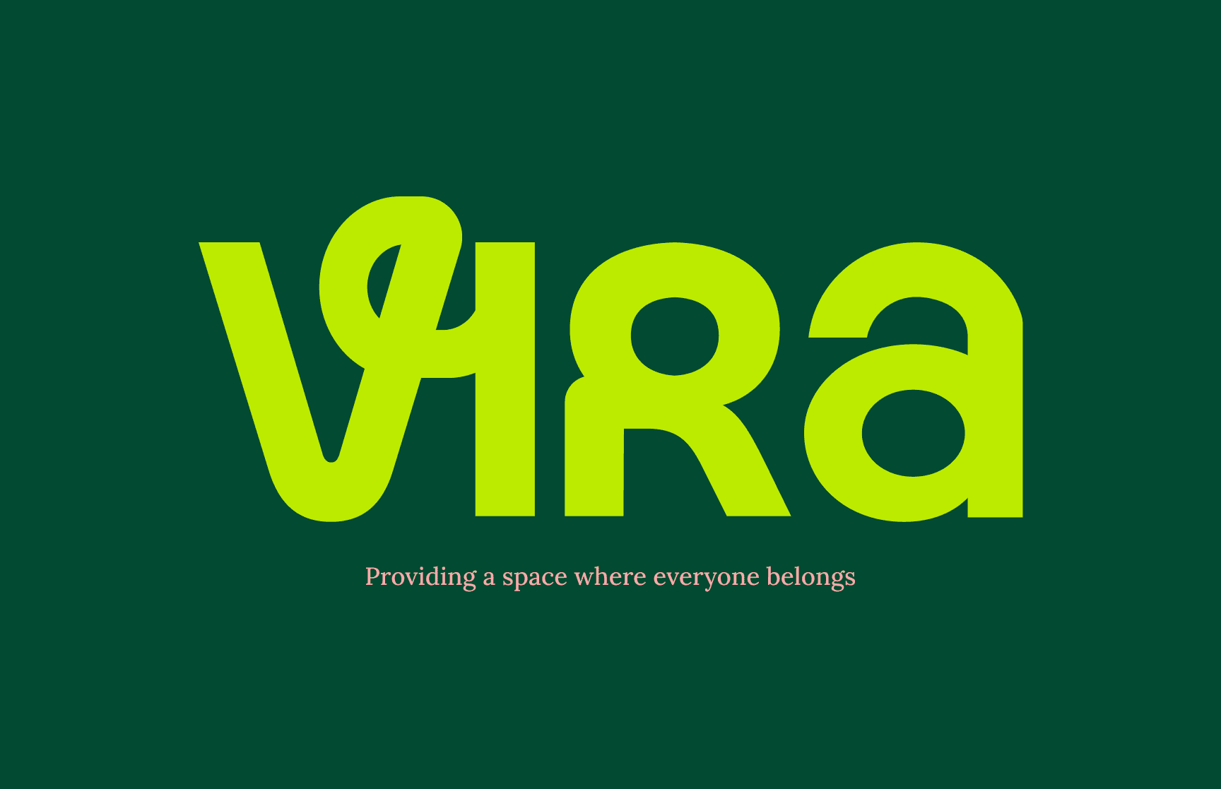
Overview
- Client
- Vira Properties
- Industry
- Real Estate
- Role
- Creative Director
Objective
Develop a brand identity capable of attracting young professionals seeking affordable smart homes.
Background
Vira Properties was founded with a clear ambition—to make quality, technology-enabled housing more accessible to young professionals across West Africa.
The challenge wasn't creating another real estate brand.
It was creating one people could immediately trust.
The Challenge
The West African real estate market is saturated with brands built around traditional luxury cues—gold accents, dark colour palettes and status-driven messaging.
Vira wanted something different.
The brand needed to feel modern, optimistic and approachable without sacrificing credibility.
My Role
- 01Creative Direction
- 02Brand Strategy
- 03Brand Identity Development
- 04Positioning
- 05Messaging
Discovery & Insights
Through a series of strategy workshops with the founder, we uncovered an important insight:
The target audience wasn't aspiring to luxury for status—they were aspiring to stability, ownership and a better future.
That meant the brand needed to communicate progress rather than prestige.
Trust rather than excess.
Possibility rather than exclusivity.
Strategy
We developed a complete brand system centred around accessibility, optimism and modern living.
Every decision—from visual identity and colour selection to tone of voice and messaging—was designed to reinforce one promise:
Home ownership should feel achievable.
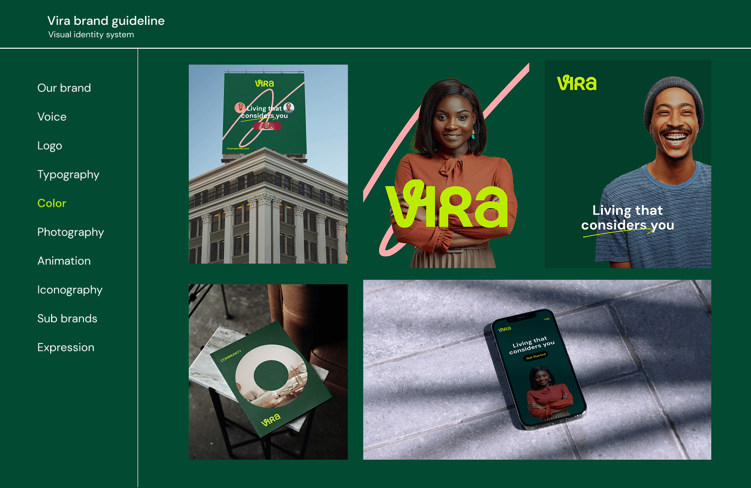
Execution
- 01Facilitated brand discovery workshops with the founder.
- 02Defined the brand purpose, positioning and personality.
- 03Developed the complete visual identity system.
- 04Created messaging frameworks and communication guidelines.
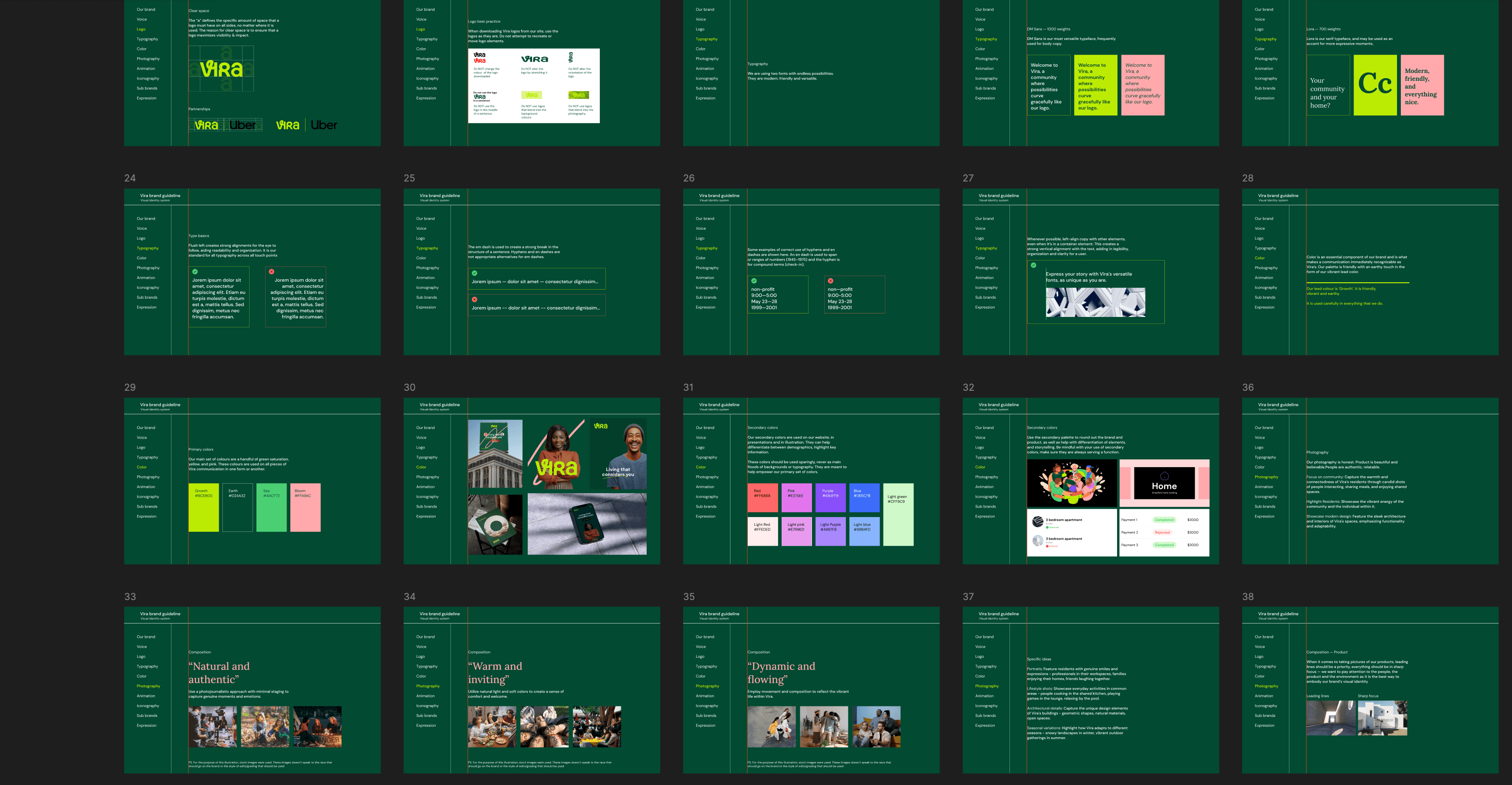
- 05Produced a comprehensive brand guideline covering execution across multiple customer touchpoints.
Results
- 01Successfully launched a distinctive real estate brand positioned for young professionals.
- 02Generated strong positive feedback during the soft launch, with early audiences describing the brand as trustworthy, modern and approachable.
- 03Delivered a scalable brand system capable of supporting future marketing campaigns and business growth.
Key Takeaways
Branding is far more than a logo.
The strongest brands create consistency between what they promise, how they communicate and how customers ultimately experience them.
Every design decision should reinforce that promise.